On 8 September, Dulux announced its Colour of the Year for 2027: Soulful Sage, a soft, silvery grey-green. The choice came out of the annual ColourFutures research run by its parent company, AkzoNobel, which for 2027 found people wanting lighter, calmer, more considered rooms as a response to a noisy and uncertain world.
Dulux describes the shade as "a versatile green that provides a flexible foundation for schemes", and has built three colour stories around it, called Glow, Light and Lift, with Ashen White, Arctic Pebble and Spiced Honey among the companion colours. Last year's pick was a trio of blues.
We read the announcement with some recognition. Sage and forest green with warm linen are the colours of the studio's own identity, and sage sits at the heart of the kitchen at Elmfield Road. So rather than write about a trend, we thought we would write about the colour itself: what it does in this part of the world, and where we have used it.
What sage does in a northern light
Northumberland light is not the light the paint charts are photographed in. It is cooler, lower for more of the year, and it changes character several times a day. A colour has to cope with a grey morning and a long golden evening and look like itself in both. In our experience sage manages this better than most. It carries enough grey to sit quietly when the sky is flat, and enough green to warm up when the sun comes round in the afternoon. Dulux makes a similar point about Soulful Sage, that it shifts through the day even when used on its own, which is exactly why it works as a whole-room colour rather than a single feature wall.
It is also a colour that gets on with other things. Against warm linen and cream it reads as soft and settled. Against brass it looks considered. Against terracotta, rust or a deep plum it becomes something richer, and the room stops being polite. That range is the point. Sage is rarely the star of a room we design. It is the ground the room stands on.
Where we have used it
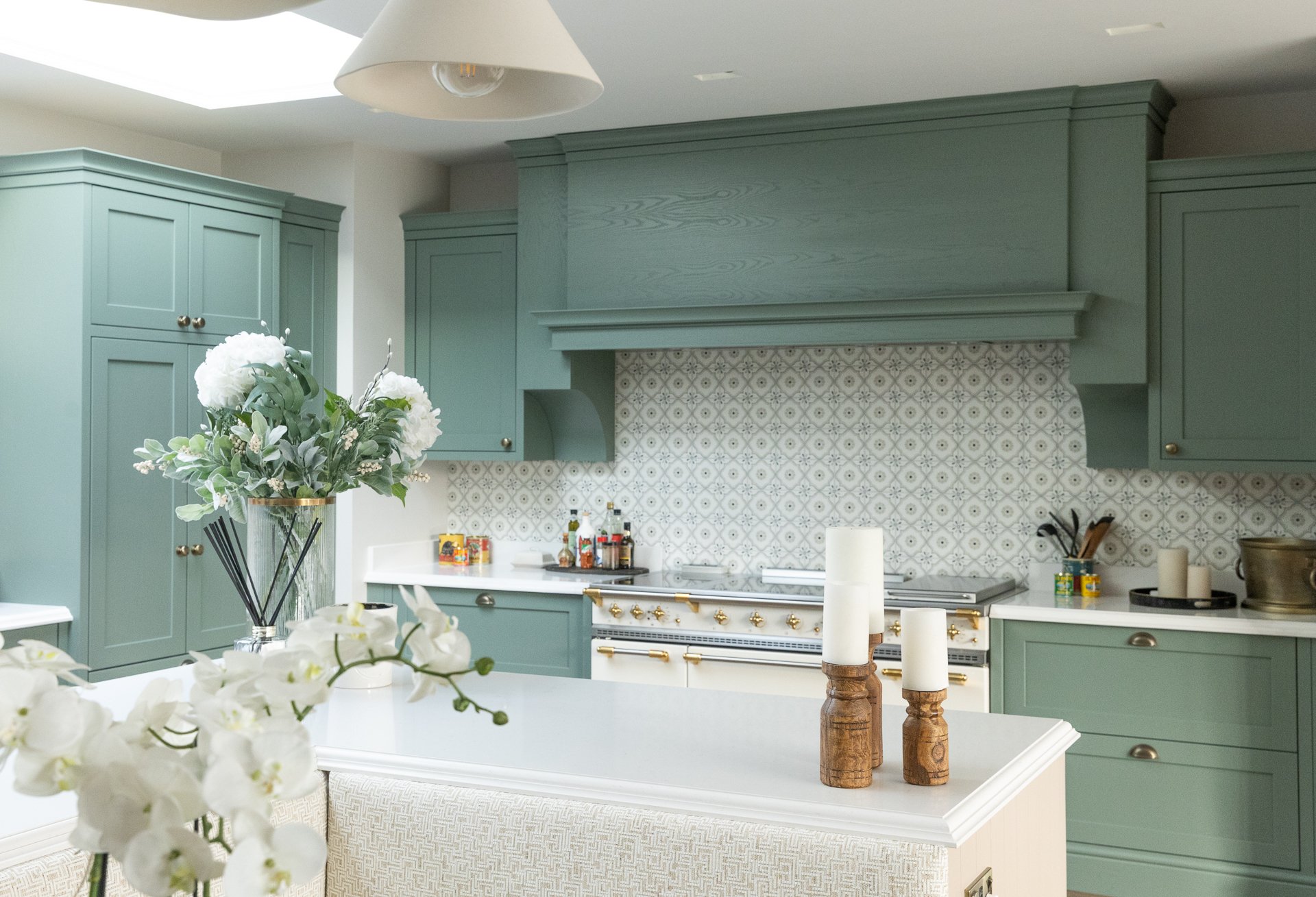
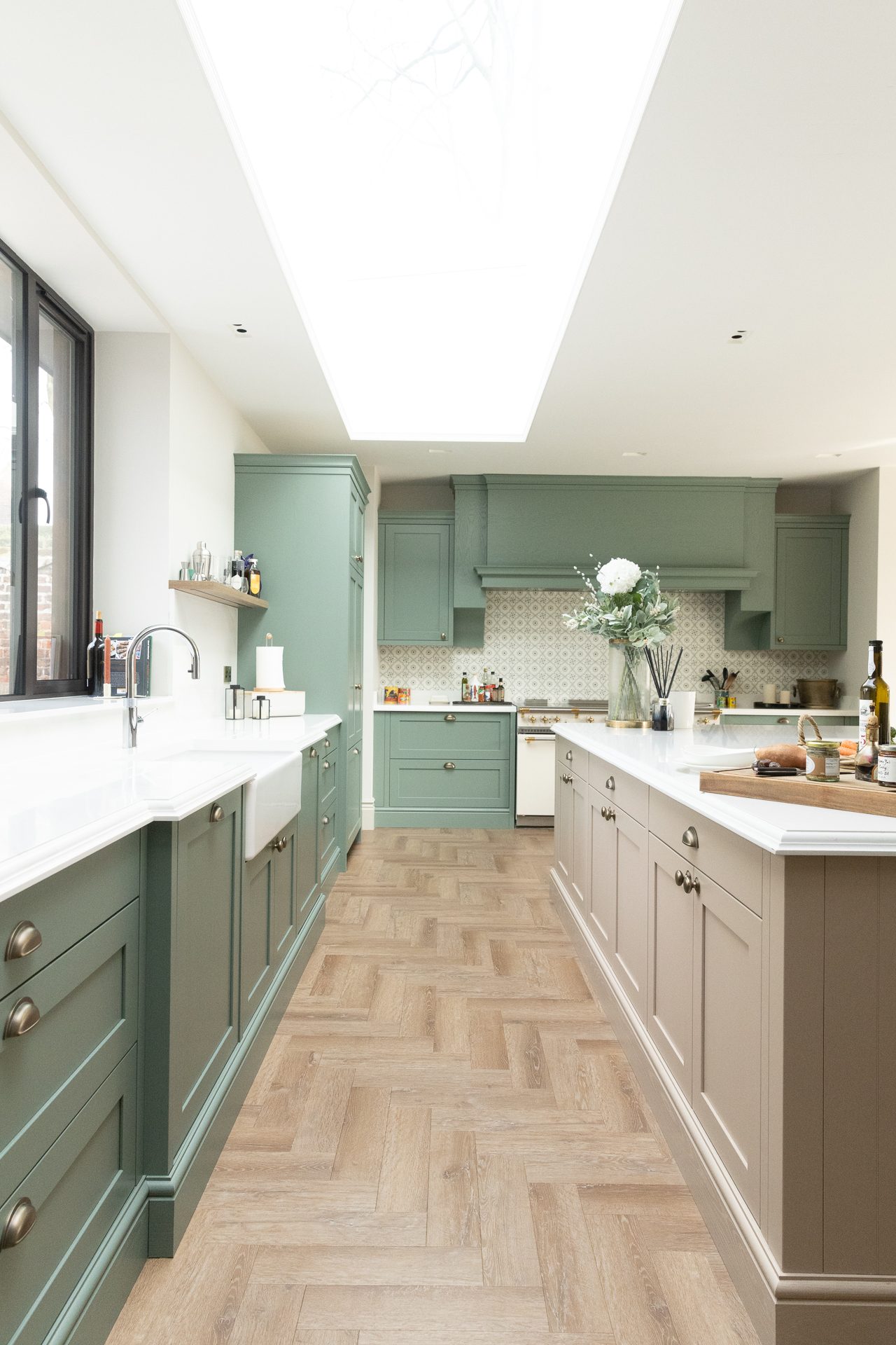
The clearest example is the kitchen at Elmfield Road. Sage green cabinetry, a Lacanche range given centre stage, a patterned tile splashback that holds the room together, and skylights overhead so the colour is seen in daylight for most of the day. The same sage runs behind the dining room's display cabinetry under the timber beams, and two floors up the nursery curtains match it, so the house has a thread running through it without anyone noticing the stitching. In the finishing touches, a plaid cushion stack in warm rust and sage echoes the kitchen without repeating it.
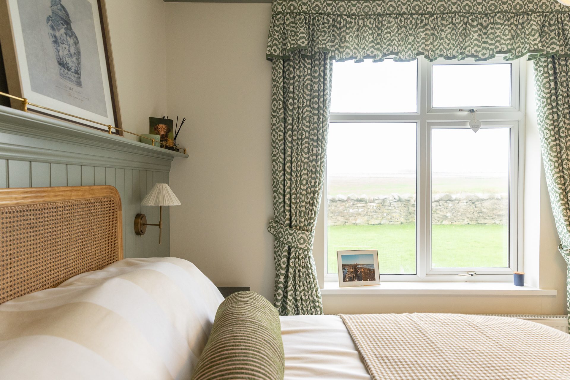
On the coast at Bamburgh, sage panelling runs to picture-rail height in the master bedroom, with a deep bed dressed in white cotton and the light kept amber. In the first guest bedroom the same panelling runs the length of the wall behind a rattan headboard, with a drystone wall and grass beyond the window. It is a cottage that asked for warmth and quiet colour, and sage was the quiet colour.
How we would use Soulful Sage
A few honest notes, since a colour of the year tends to arrive with a good deal of enthusiasm attached.
- Match it from a tester or a fan deck, never from a screen. Greens are the colours most likely to disappoint between the photograph and the wall, and a grey-green in a north-facing room can go flat unless you have seen it in that room, at more than one time of day.
- Decide what it is sitting next to first. The wood, the metal, the cloth and the floor will change how green it looks far more than the paint chart will. This is the part of a consultation that earns its keep.
- Consider it for joinery, not just walls. Sage on cabinetry, panelling or a window seat gives you the colour in a form that ages well and does not need repainting every few years.
- If the house is older, the finish matters as much as the colour. A breathable paint on a solid wall is a technical decision, not a decorative one. We have written about that separately: lime and breathable finishes in stone houses.
- Do not feel you need to redecorate. If a room already has a green you love, the announcement is a reason to feel quietly vindicated, not to start again.
Colour of the year lists are useful for one thing above all: they give people permission. If Soulful Sage gives someone the confidence to paint a kitchen green instead of white, that is a good outcome, whichever tin it comes out of. If you are weighing it up for a room of your own and would like a second opinion in that room and in that light, we are always happy to talk it through.